Nordhaven Collective
Visual Brand Identity | Signage Systems | Merchandise Design
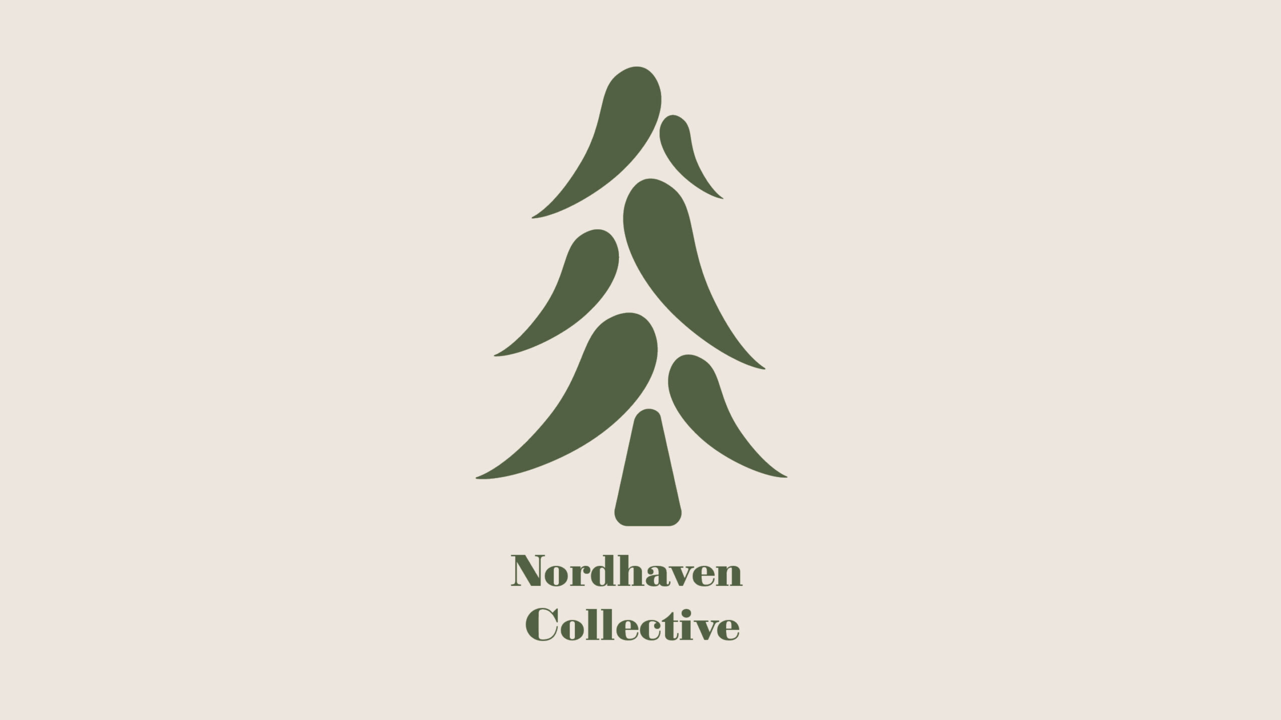

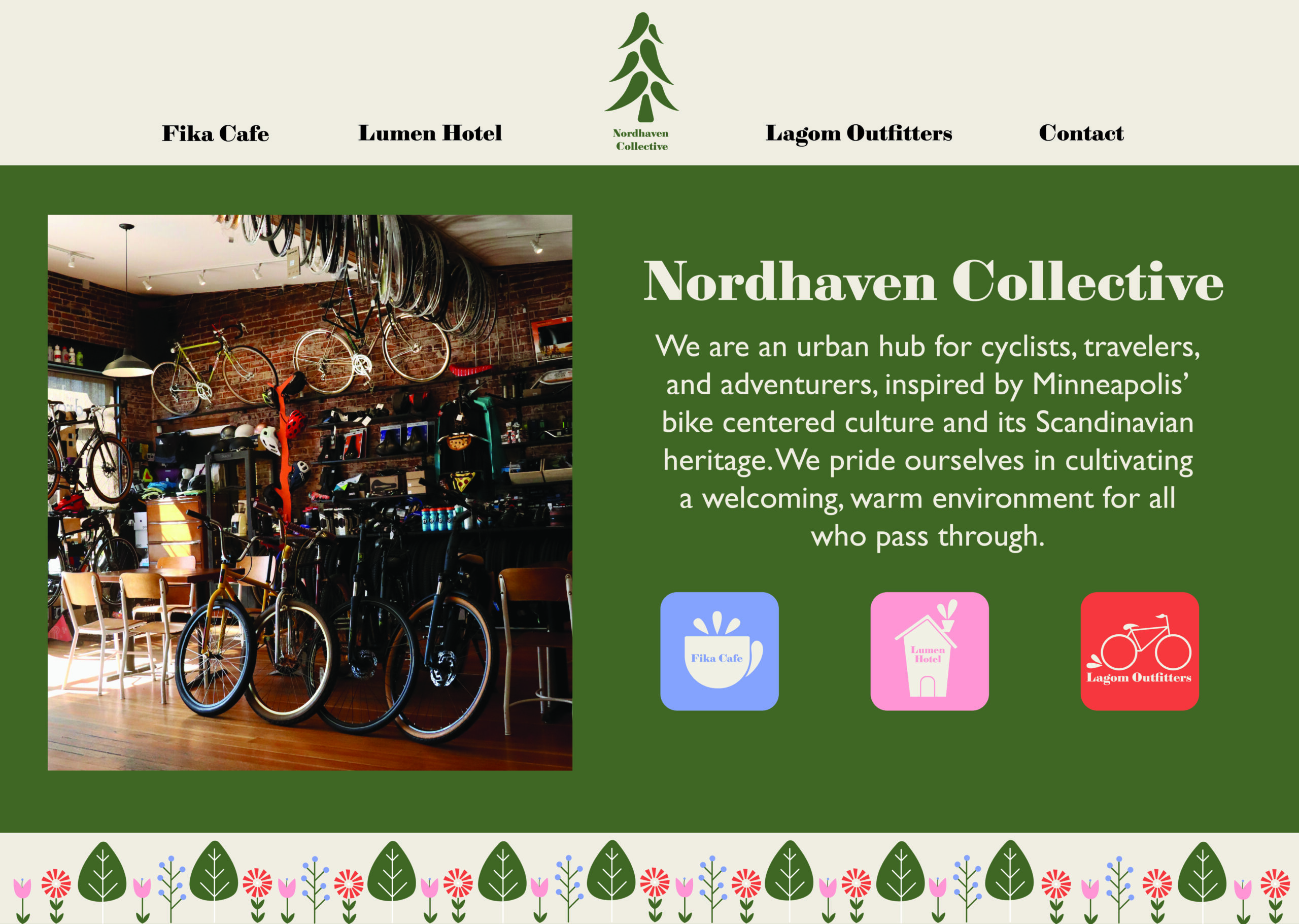
Nordhaven Collective is an urban hub for cyclists, travelers, and adventurers. Located in Minneapolis, Minnesota, and inspired by its bike-first culture and Scandinavian heritage, the collective includes three distinct businesses that operate independently but share ownership and a cohesive brand sensibility.
The Challenge: Create a unified umbrella identity for Nordhaven Collective as well as distinct brand personalities for Fika Cafe, Lumen Hotel, and Lagom Outfitters. The system must balance Scandinavian-inspired minimalism with the warmth and energy of Minneapolis' cycling culture.
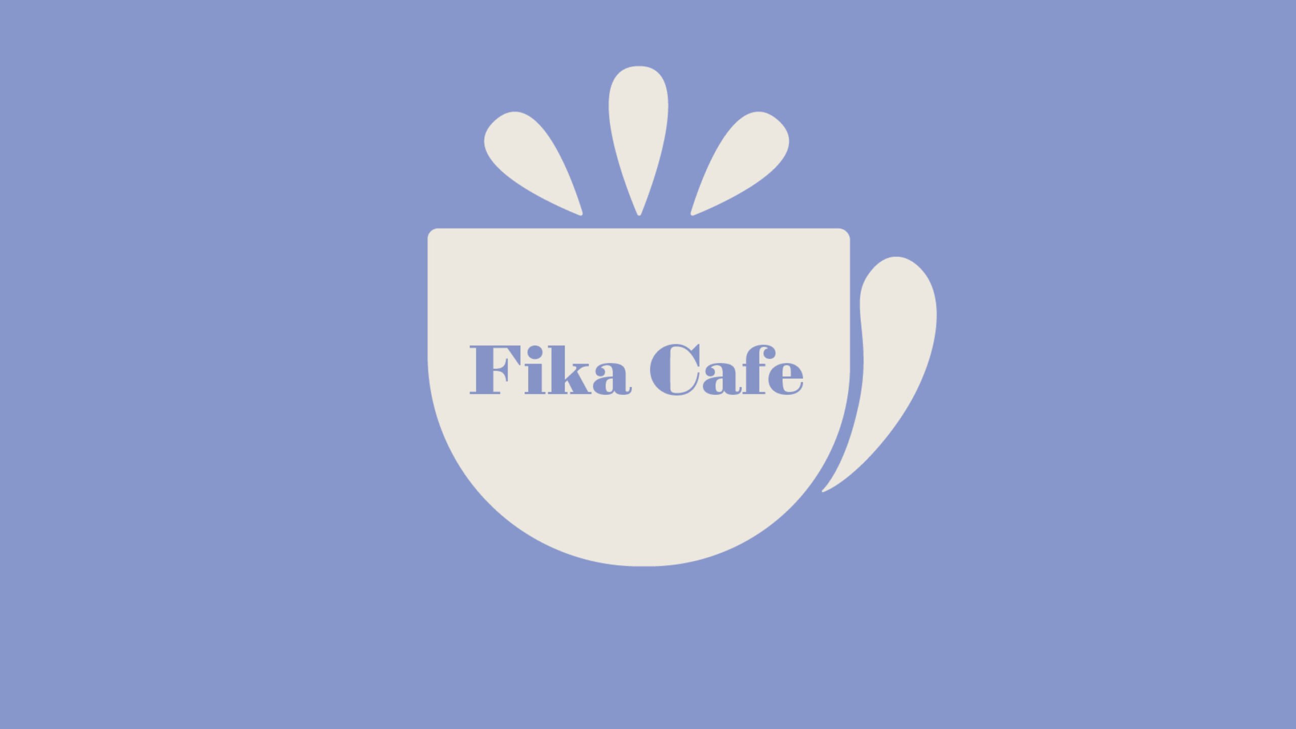
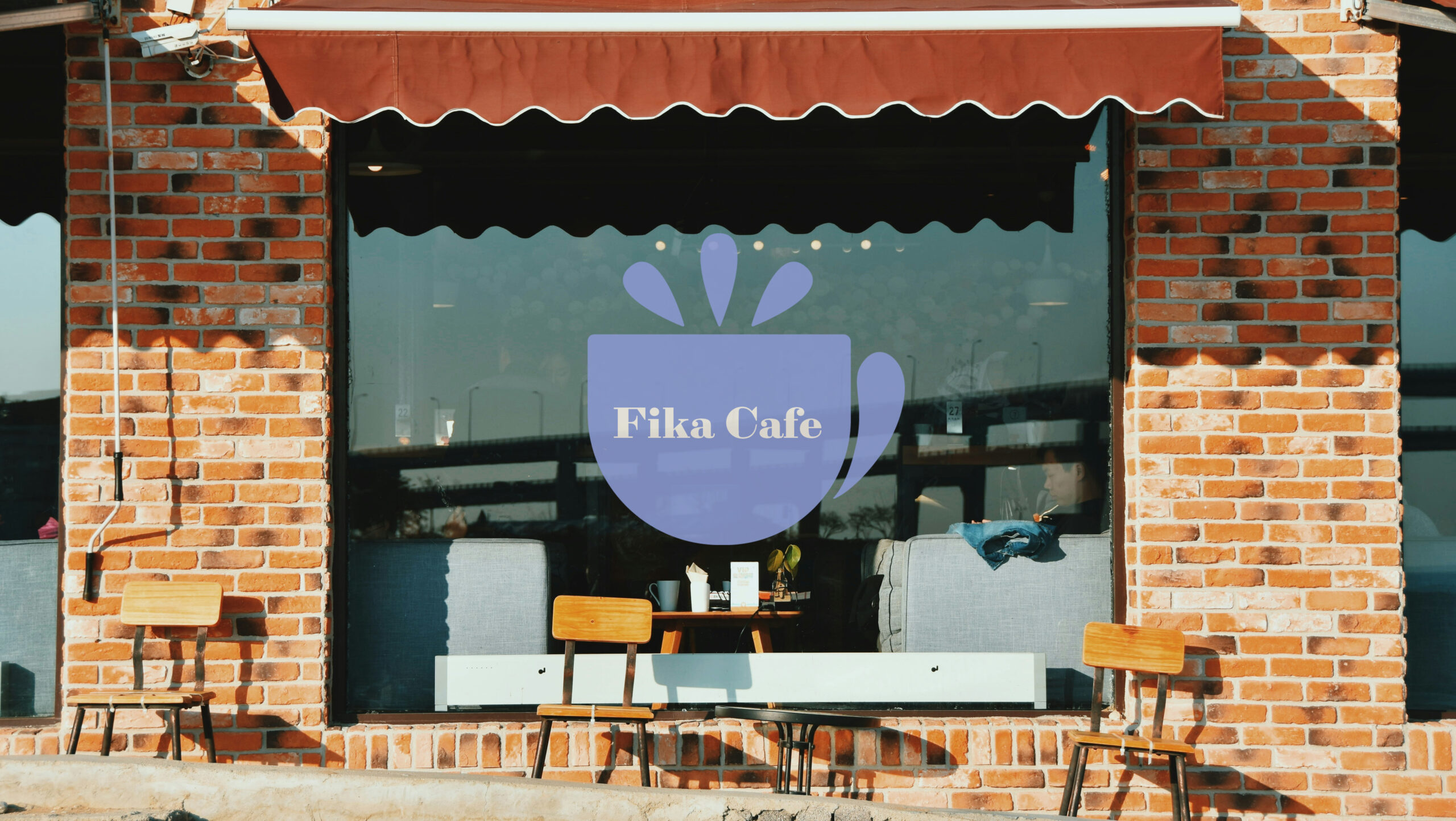
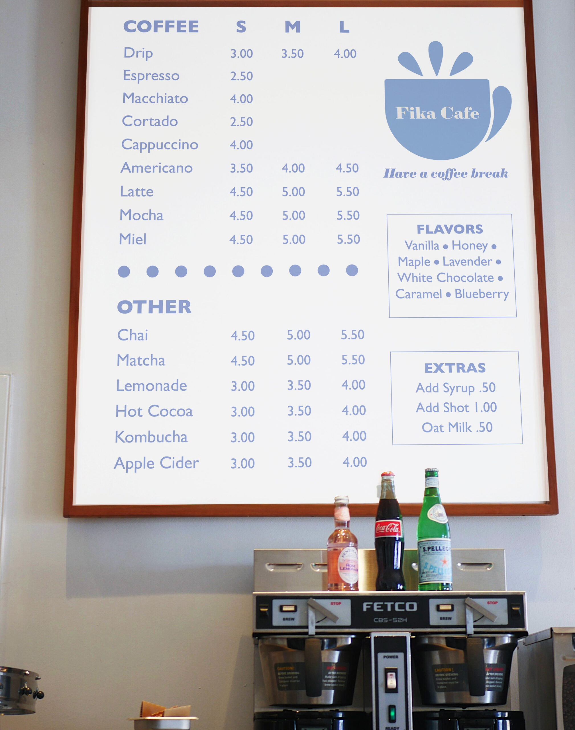
Fika Cafe
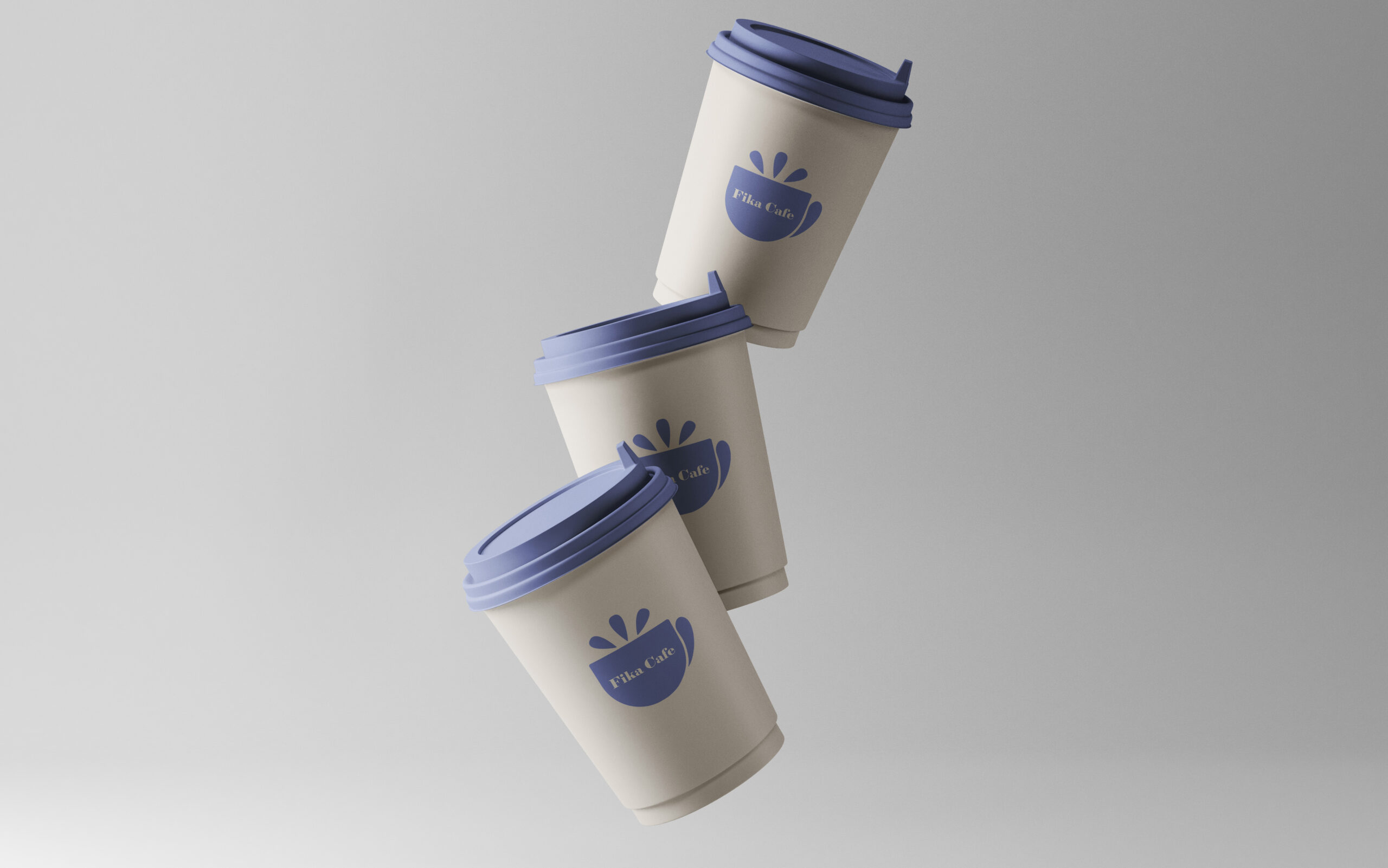
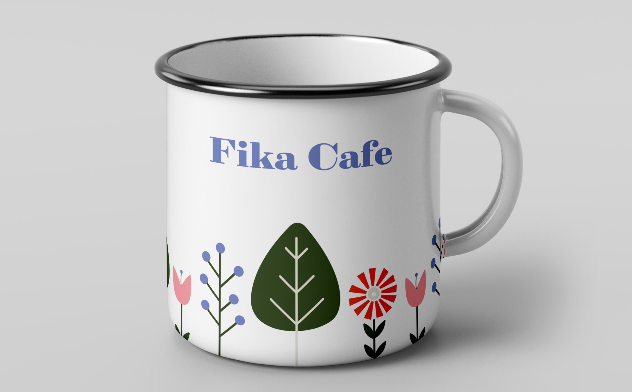
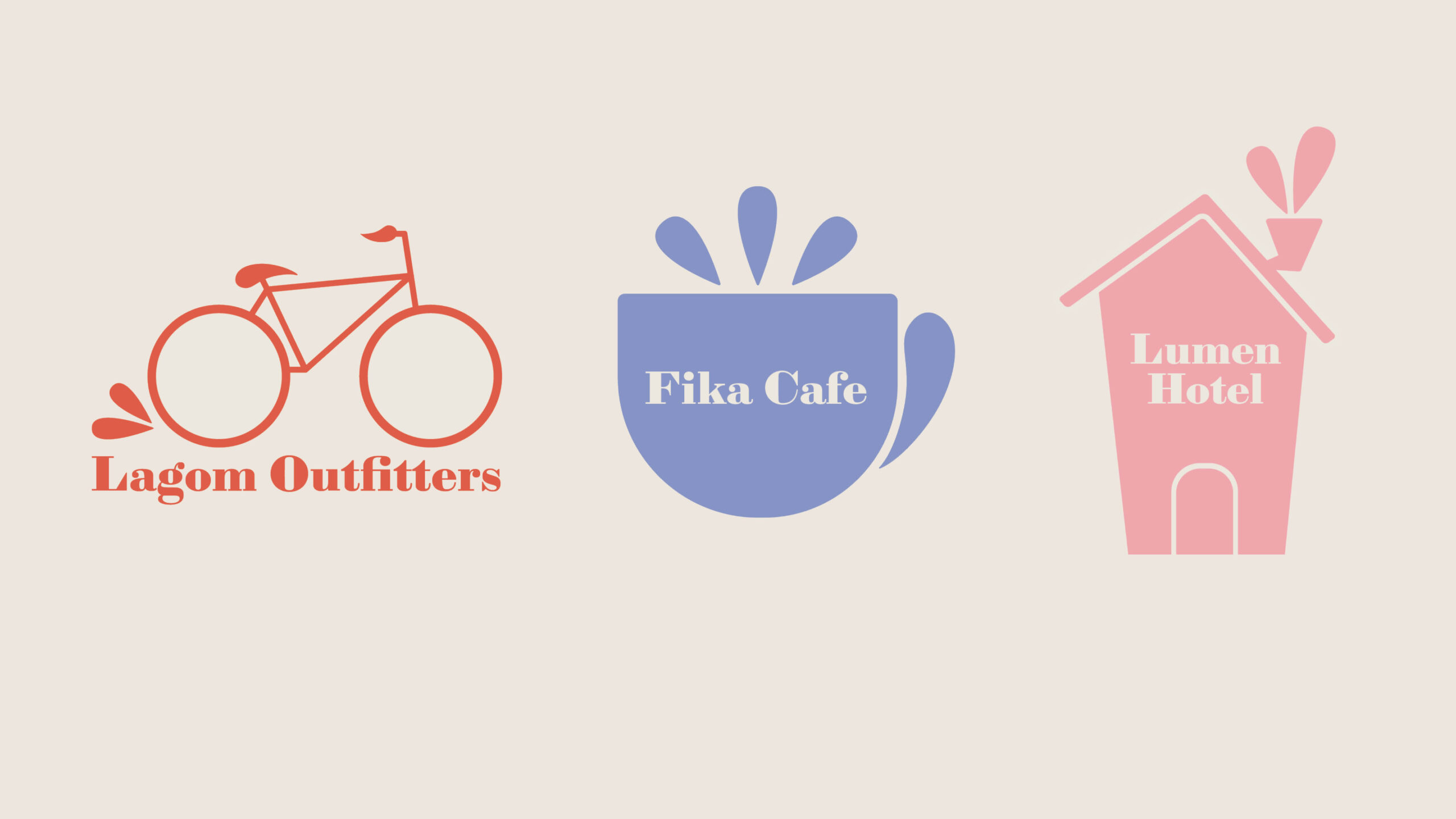
For each company, I stuck with a single color, plus a cream color, that would come together into a cohesive system. Fika Cafe's logo is simple and clean, inspired by Scandinavian design. For the cafe's assets, I created a vinyl sign, a menu board, a to-go cup, and a mug that can be purchased. Each element centers around the simplicity of the logo and incorporates the lavender color to remain cohesive.
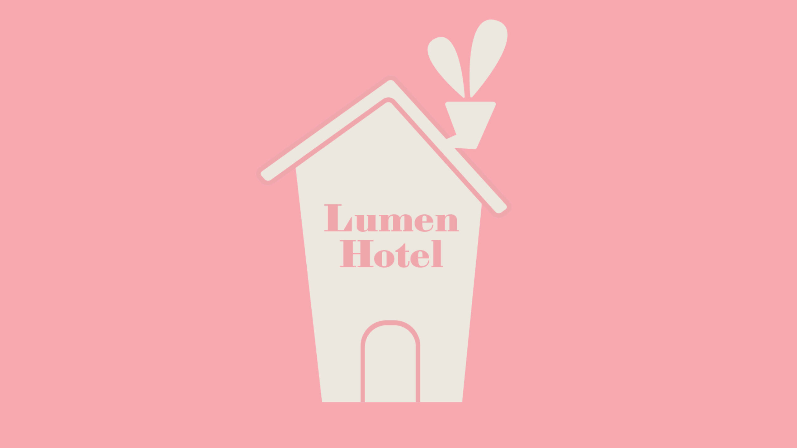
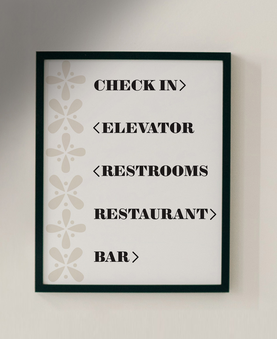
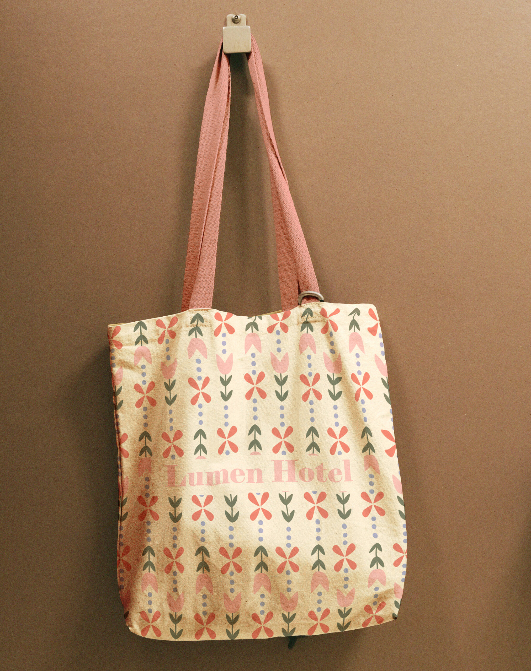
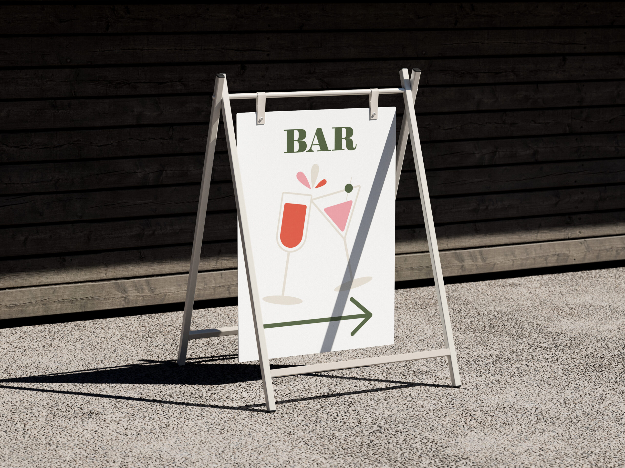
Lumen Hotel
Like Fika Cafe's logo, Lumen Hotel has a simplistic logo, incorporating the same teardrop shape to keep the logos a cohesive system. The wayfinding signs and tote bag also reflect the simplistic style, focusing on readability and including elements used in the other merchandise.
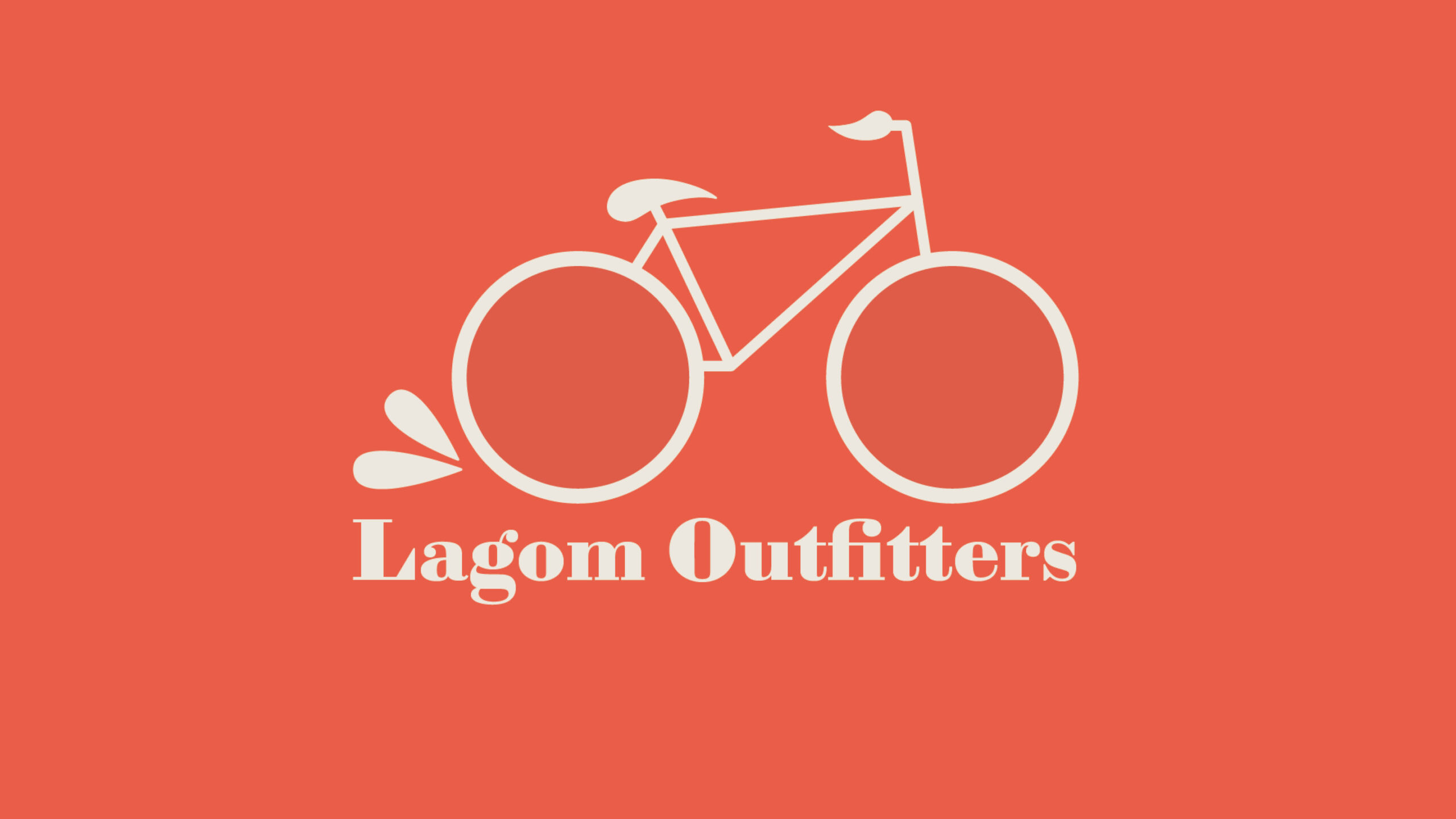
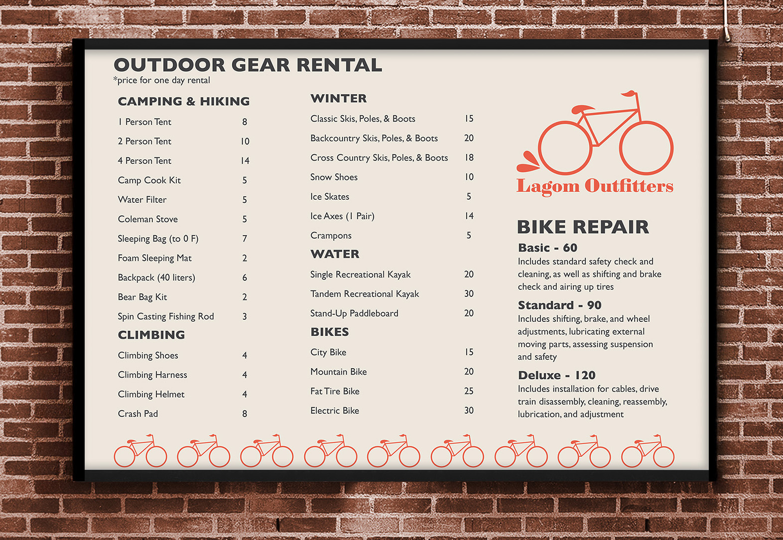
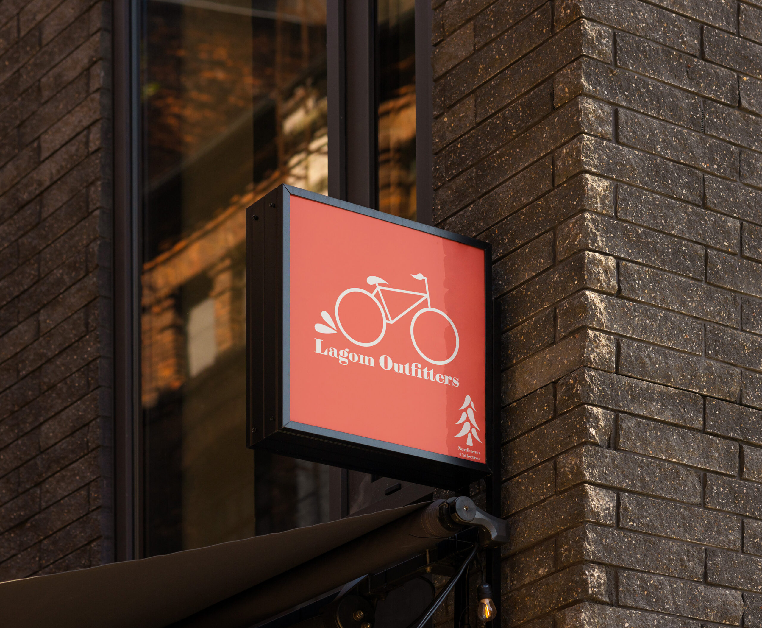
Lagom Outfitters
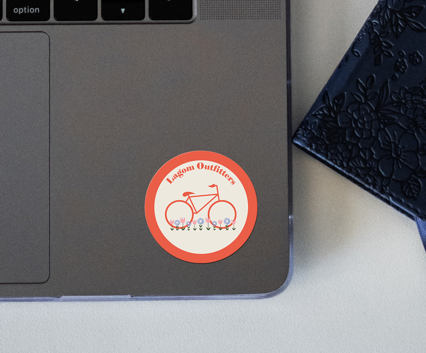
Like the other two businesses, Lagom Outfitters' logo is clean and reflects the brand. The rental sign mirrors the simplistic layout of the menu board for Fika Cafe, and the business sign shows the logo as well as the Nordhaven Collective logo in the corner. The sticker incorporates the flower elements found in the merchandise for the other companies. While each logo is different and the merchandise is made to reflect the specific company, they all include overlapping elements to create a cohesive and visually unique system.

Home
Design
Photography
Let's Chat!
Resume